
Reality Check: Picture Perfect Portion Sizes (Infographic)

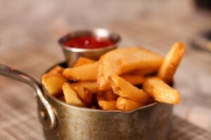
Picture this: A small fast food French fries today is three times the size it was 40 years ago, and a restaurant serving of pasta can be as much as seven times the serving size you’d find on the side of a box of spaghetti. One of the biggest contributors to our nation’s obesity epidemic is our problem with portion distortion. Portion sizes have grown exponentially, but do you even know what a proper portion looks like?
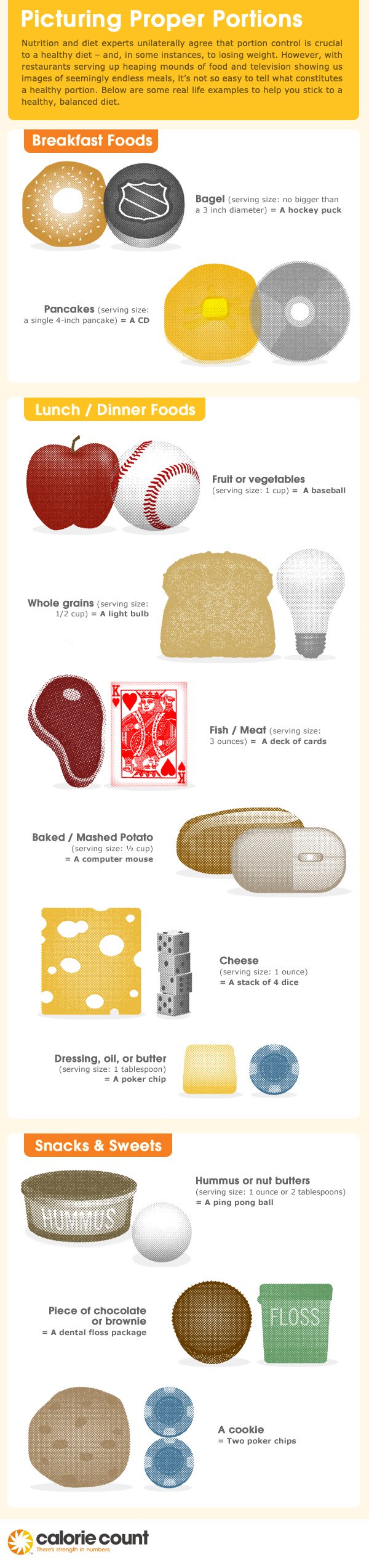
The people at CalorieCount.com, an online food diary and coaching service, have created the cheat sheet below to help us remember what a proper portion is supposed to look like, based on guidelines from the USDA—and it may surprise you.
Muffins used to be the size of a baseball, but now they tend to be bigger than a softball. And when was the last time you were served a three ounce serving of steak at a restaurant?
Research has shown that just seeing these kinds of comparisons can help you make better portion choices in the future. So study up, then chow down, mindfully!
Top Image: [F]oxymoron